
S—ZE Records
Creative Fields:
Brand identity
Logo design
Design concept
Art Direction
Web design
Communication strategy
Final art
Brand identity
Logo design
Design concept
Art Direction
Web design
Communication strategy
Final art
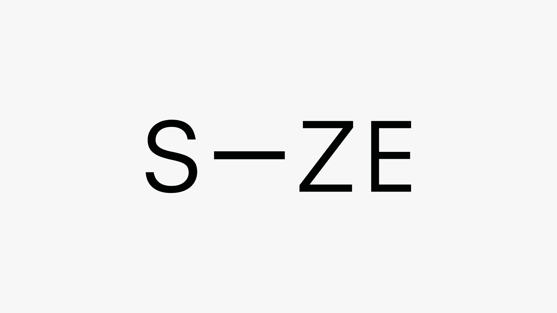
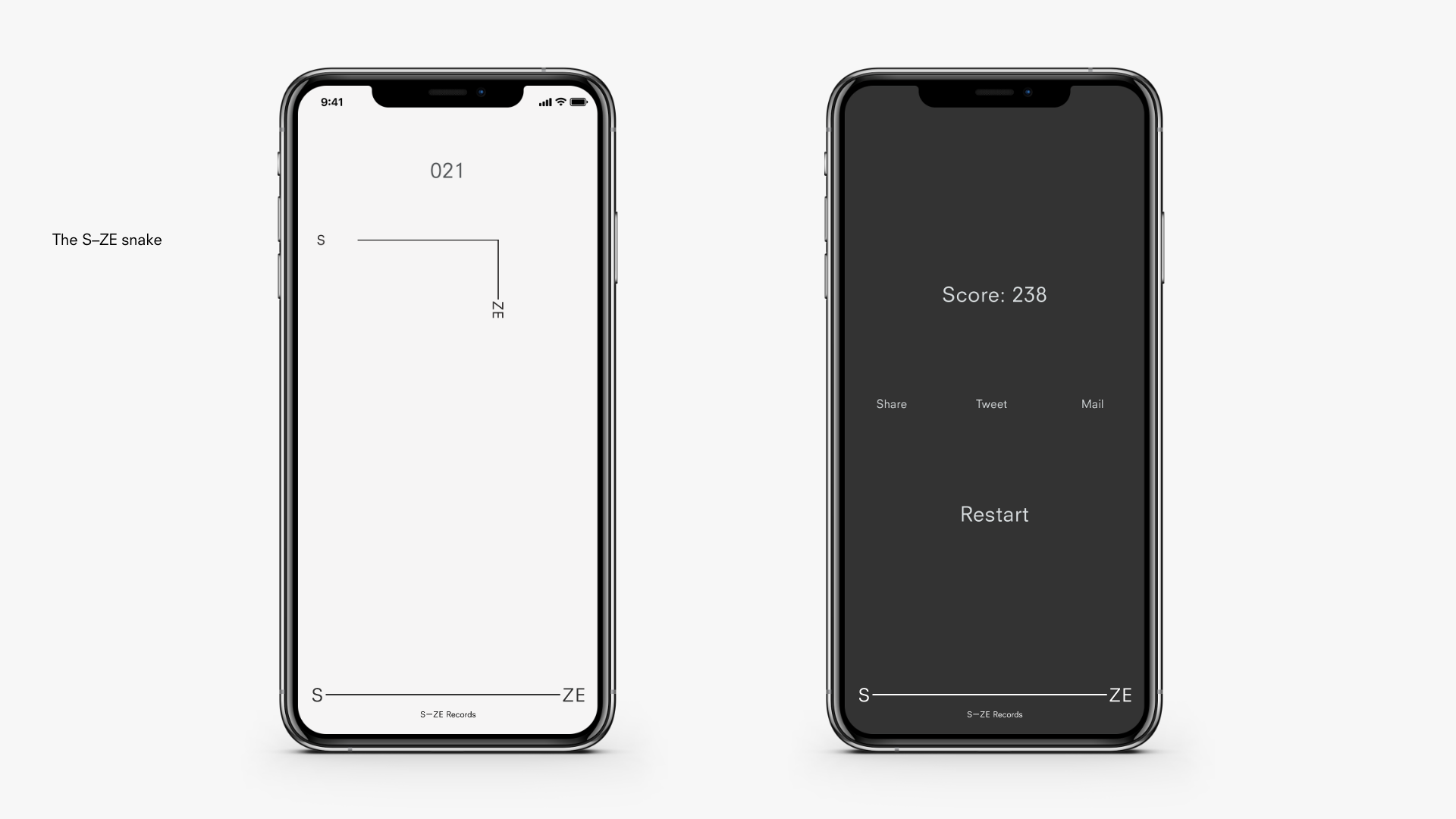
Trying out a new S–ZE.
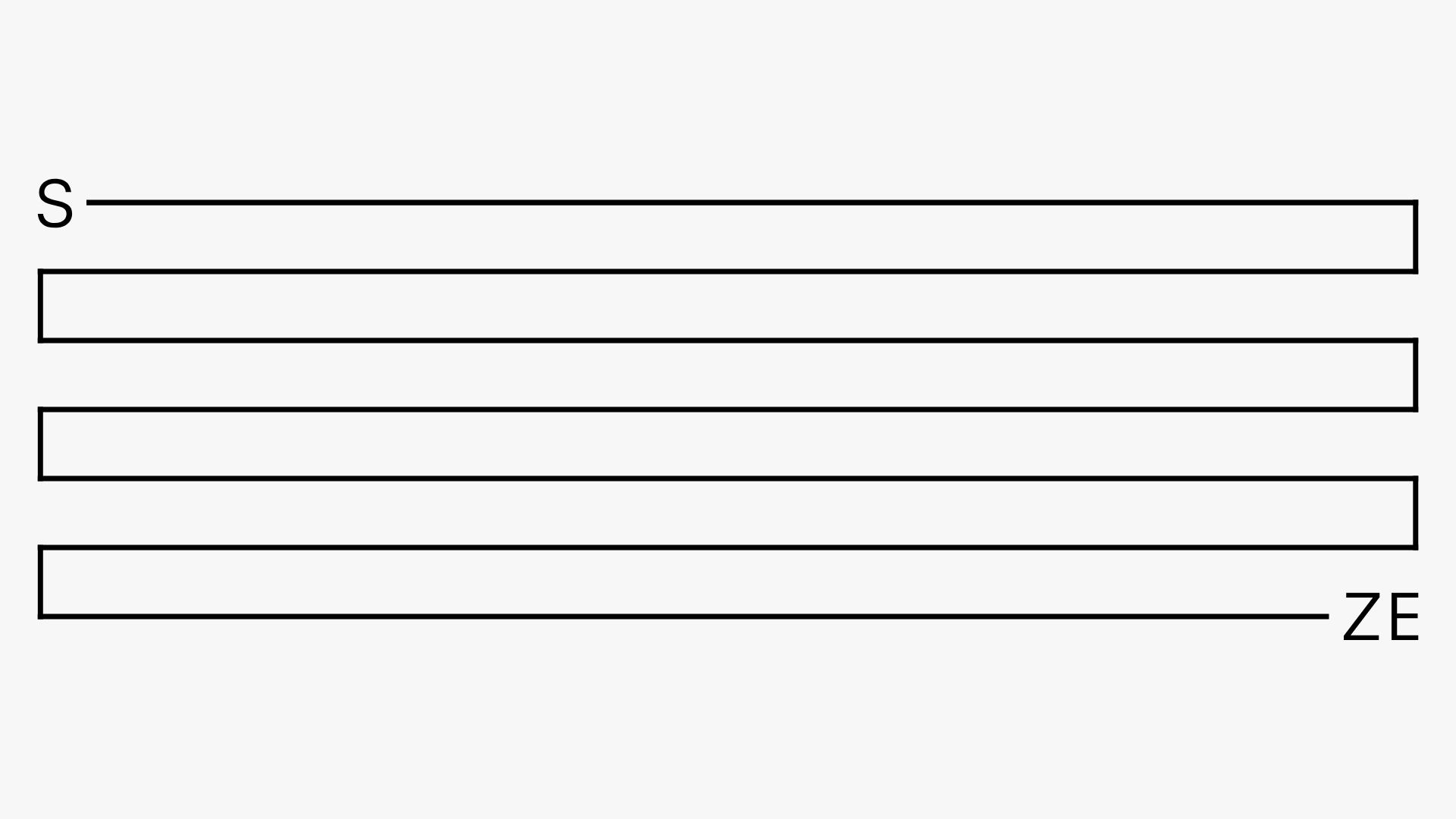
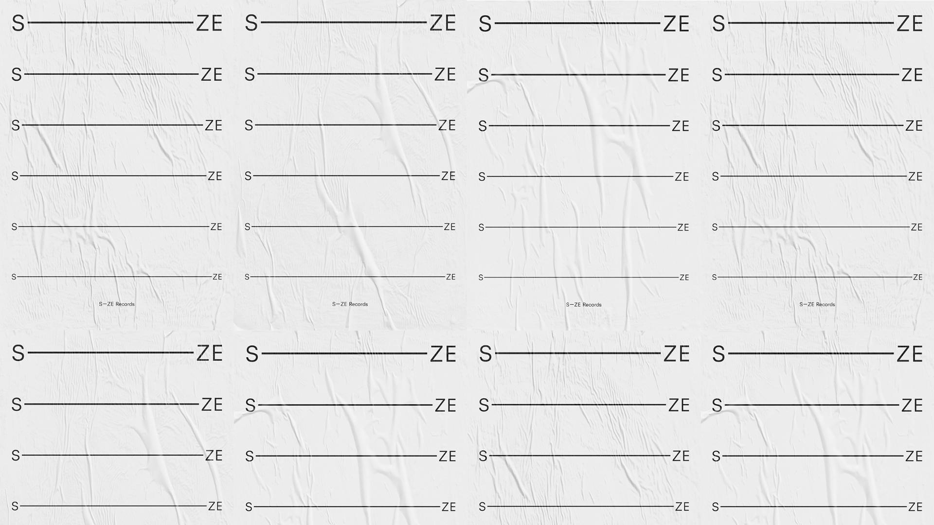
We visualized the growth of Size and the growth of the individuals who contribute to S–ZE. After looking at it from an interactive community’s point of view, a flexible identity began to take shape. The new logotype then became an animation that comes to life by expanding into the maximum size of its format. It strives towards its limits, representing drive and ambition and a constant aim to move towards the future.
The S–ZE identity is designed and prepared for new frontiers and only in the beginning of its journey. S–ZE rises from the underground scene into the light with a solid base to evolve upon.


We focused on the size of things.
How much does size matter? The record label Size was founded two decades ago by Steve Angello solely to enable him to release his own tracks. Today it is a full-blown label with offices in the UK, Sweden and the US. With new plans in sight 2017, we were asked to re-create their identity.


In contrary to what most people visualize when thinking about electronic dance music, an underground nightclub scene reflected by dark and neon colours, we focused on where the music is actually experienced; In the car, at work, when walking. Basically during all hours of the day the music serves as a reality escape, which made a light and airy colour scheme and typography come naturally.
Cover for Minimix 2017
– A medley of all the releases of S-ZE during 2017
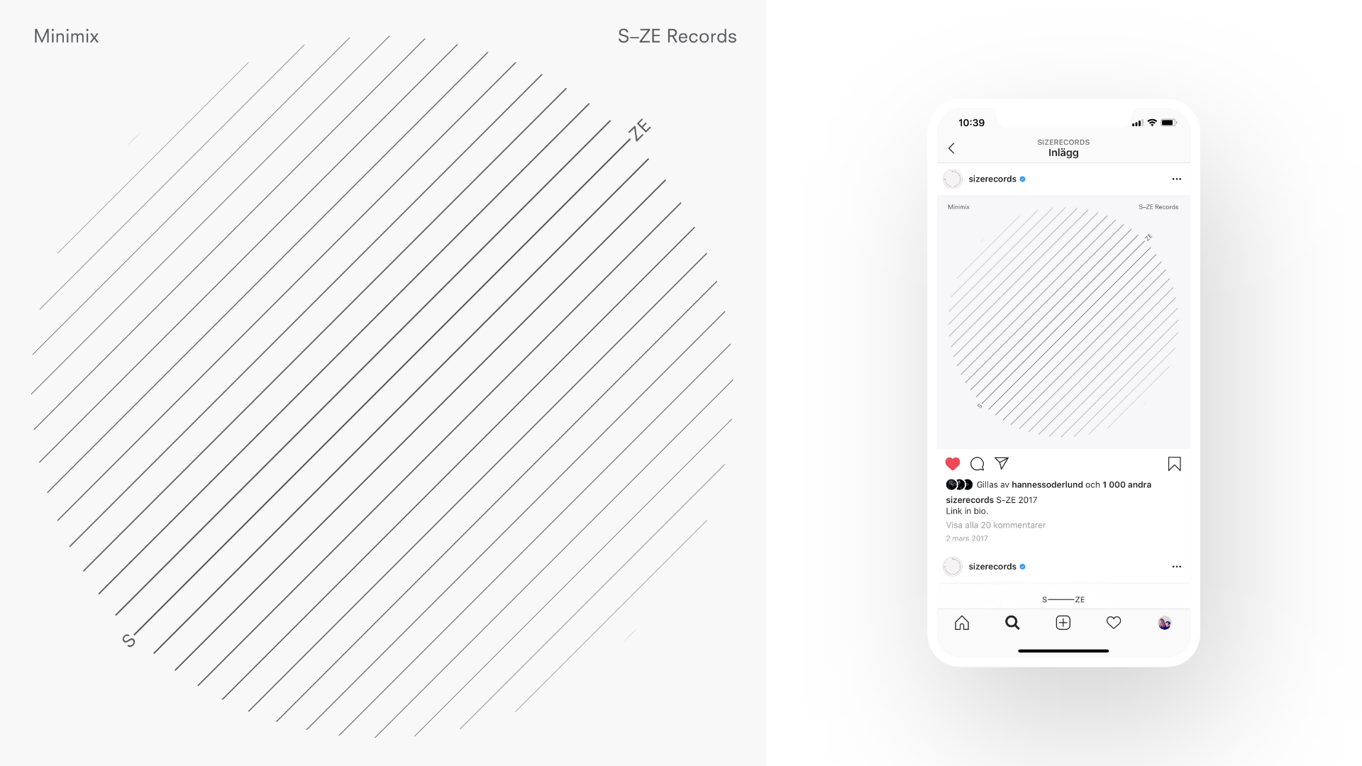
Motion blur is key element in images.


s-ze.com
